There are web design mistakes website designers make that go mostly unnoticed. Apart from some scary movie they just watched, these web design mistakes could be scaring away your website visitors without your knowing it.
With a poorly designed website, you’re most likely robbing your digital business of precious clicks, sabotaging your chances of success in the digital ecosystem by driving away potential customers.
Good news is, you don’t have to be a WordPress expert or web designer or even an expert in web development to fix some web design mistakes and improve a poorly-designed website!
Follow me on this journey, as I uncover in detail, six website design mistakes that could be spooking your site visitors, and how you can get them fixed – so that your website becomes everybody’s favourite.
Web design Mistake #1 – Terrifying User Experience
Let me take you on a ride back memory lane.
Can you remember the last time you visited a brick-and-mortar store? Do you remember your overall experience in that store? Was the store setup and layout, atmosphere and decor appealing? Were the aisles too tight? Store attendants responsive? Were there elements of the store’s overall setup that negatively impacted your shopping experience? Whatever your experience, I could guess it helped shape your notion about this store and if you wanted to shop there again.
Well, the same thing happens on your website.
The kind of experience site visitors have on your website – from the moment they land there – affects to a large extent, how and if, they would stay engaged on your website.

Poor navigation, haunting performance, nightmare design elements, outrageous colour themes, and your visitors want to quickly move on.
For better and more positive user experience, your navigation and drop-down menu should be intuitive. It makes it easy for site visitors to find what they’re looking for. Keep your site simple and beautiful, and fine-tune the operations.
Truth is, if your site visitors have a good experience being on your site, they would want to come back. If they do come back, they will engage with your content, helping you find success with your online endeavour.
web design mistake #2 – Snail-like Site Speed
In the age of 5G and fast-loading internet, nothing kills user enthusiasm than a slow-loading website. Before you say “Jack!”, they’ve moved on to the next search result, leaving your engagement metrics suffering and constantly in the red.
Let me put it in perspective, site speed could be the single most important determinant of success (or failure) in your online business. It affects everything, from sign-ups to sales and search traffic.
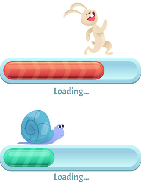
Patience is thinning, and visitor expectations have heightened. Close to 50% of site visitors abandon a site that takes more than 3 seconds to load, while about 47% of site visitors expect your website to load in two seconds or less.
To make matters worse, almost 80% of online shoppers who have a poor experience with a website say they won’t return to buy on the website again.
So much riding on site loading time and performance right?
Do you have an annoyingly slow page? To give your visitors ultra-fast loading times and excellent performance, consider using PageSpeed Insights from Google to get a clue on your site performance and where you need to make improvements.
You can also optimize your site speed by patching up caching issues, trim down bulky codes, optimize site CSS, and most importantly, choose a good website hosting provider.
Web design mistake #3 – Ugly Font
Using fonts haphazardly on your website is a major web design flaw. Even though subconsciously, if affects your user experience a lot. The fonts on your website matter, and should be implemented with careful thought and intentions.
Carefully thought through font size, text combination and colours are aesthetically-pleasing and can drive your conversions through the roof. Just as with other design elements, typography has rules that tells you what and what not to do.
Carefully crafted typography can drive conversion rate up, establish your brand identity, encourage action and engagement, create good sensory experience and amplify your message.
Check other websites for typography dos and donts, and plan your font strategy with meticulous consideration or else you risk interrupting usability and cognitive fluency.
web design mistake #4 – Unresponsive Layout
Responsive layout means that your website design works well on every device – mobile phone, tablet, desktop.
Data from 2018, indicated that the population of unique mobile users globally topped 3.7 billion. Also in 2018, 52% of web traffic came from mobile devices, and by 2022, the mobile-only audience is expected to grow to 55 million.
Seeing all of these statistics, what sort of website ought ye to build?
Mobile internet usage has gained significant traction in recent years and is on track to exceed desktop internet usage.

This means that if your website is unresponsive – not optimized for different screen sizes – including tablets and smartphones, you will most likely lose a lot of traffic and site visitors will find it difficult engaging with your content.
Google’s indexing policy is mobile-first. What this means is that Google uses the mobile version of your website content first for indexing and ranking. So, a responsive site layout isn’t just good for user experience, it’s also good for SEO.
Your brand image is also affected by (un)responsive design.
46% of mobile shoppers say they will not buy from a brand again if they had a poor mobile experience the first time. Meanwhile 89% say they will recommend a brand after a positive user experience.
What’s the takeaway? Prioritize responsiveness when building your website. Choose a theme that is responsive across different browsers, mobile and desktop devices.
Web design mistake #5 – Ghostly Calls to Action
When visitors come to your website, they shouldn’t feel like they have just entered a haunted house – not knowing what to expect next.
Eerie noise in the background? Skeleton behind the door? Ghost in the next room? They shouldn’t be left wondering what they’ll see next or what to do next.
Site visitors should easily find what they’re looking for on your website. Finding your contact page, navigation menu, blog, email sign-up forms, etc shouldn’t be difficult.
It should also be clear what you expect them to do when they find these calls-to-action. Do you want them to read your blog, sign-up for emails, purchase a product or contact you.
A clear call-to-action does a lot to increase your conversion rate, by helping your site visitors know how to engage with you. Use clear, prominent and well-distinguished icons or buttons to guide them to perform a specific action. And make it prominent on every page where it appears.
Lots of web designers don’t count this as one of the web design mistakes, but it is.
Web design mistake #6 – Expired (Non-existent) SSL Certificate
Safety on the internet warrants a full article of its own, and is a discussion for another day.
Web users worry about online safety. In America alone, almost 74% of people who use the internet say they’re worried about online privacy. What this means is that site visitors want your website to be a safe place for them to visit. It should be free from malware and other malicious software.

To make your website safe, purchase and install SSL certificate. This move alone will signal search engines and your website visitors that your site is secure and safe to visit. Just the presence of that locked padlock in your browser’s address bar does wonders.
Here are other things you can do to keep your website secure;
- Utilize secure plugins
- Use HTTPS
- Configure file permissions
- Regular site backup
- Use a quality web host
Recommended reading: What You Need To Know Before Choosing A Hosting Provider
Conclusion – Fix Your Web Design Mistakes
Fixing your web design mistakes will give you a good placement on search engine result pages, improve user experience, enhance site usability, establish your online presence and reduce your bounce rate. And this is apart from your visitors wanting to come back because they had a good experience the first time.
Stop chasing away your visitors with poor site design. Offer them the best of online experiences every time they land on your page. A well-designed website is always worth the extra money and effort.
Ready for a fix?
If you’re ready for a website makeover, get a treat with my WordPress services. I will create a polished and functional website to reflect your vision, and won’t bore a hole in your pocket. Check out my services or get in touch today.
Last Update: July 27, 2023 by Dienye Diri

- UK and US Forge Agreement to Create AI Safety Tests - April 2, 2024
- UAE Setting Up AI-focused fund to Build its Own Chip - March 25, 2024
- New AI Tool Detects Cancer Signs Radiologists Missed - March 25, 2024